Connect
Helping Users Build Trust in Search
Connect is a B2B e-commerce platform for automotive parts, used by mechanics and garage owners in 6 European countries.
Product information currently sits behind a collapsible button on search result pages.
Analytics suggested users wanted richer product information, especially images and specs, to shop with more confidence.
Role
End-to-End UX Researcher and UX/UI Designer
Duration
3 months
Tools
Figma, FigJam, Beamer, Userberry, Teams
Problem to solve
Users faced too many similar part variants without enough information to tell them apart, leading to slow manual comparisons and more ordering errors.
Solution
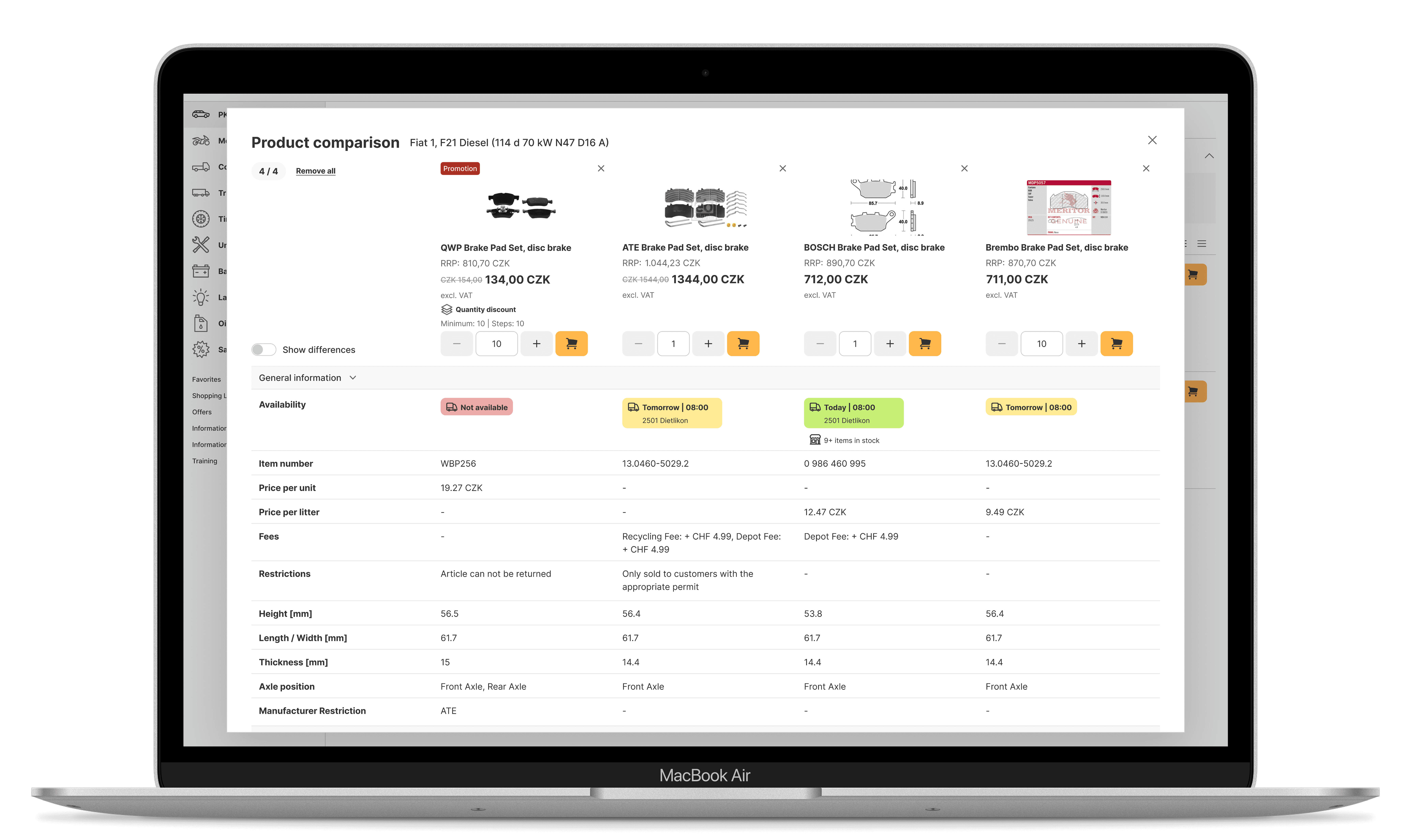
A comparison tool that puts critical specs, images, and fitment info in one view, making it easier to compare options, decide faster, and buy with confidence.
Final design


Background
Instead of jumping to a solution, we started with the problem:
"How do users know a part is right for them, and where does their confidence break down"
We went into research with three hypotheses to explore:
H1 Missing or hard-to-find information causes uncertainty.
We assumed users couldn't find the info they needed during search, so they looked elsewhere, and that uncertainty showed up before purchase, not after.
H2 Poor structure increases hesitation.
We assumed that even when information existed, if it wasn't clearly prioritized, users had to do extra mental work to compare it, and that was slowing them down.
H3 Missing visibility into related or compatible parts slows purchasing.
We assumed users needed to check compatibility and compare options, and that the search results weren't making that easy or clear.
Research
Competitor analysis
5 competitors, simulating the user journey to spot where information is unclear or missing.
Survey
1 week, 291 responses in total, 6 markets, 24.9% completion rate.
1:1 interviews
9 participants, 3 markets, remote interviews with mechanics and sales reps.
Usability testing
215 sessions, 4 markets, 34% completion rate, 2 variants, unmoderated remote A/B testing.
What we found
56%
Don't feel confident in search results alone.
Specs and dimensions mattered most, closely followed by OEM numbers, images and fitment.
35%
Had ordered more than one variant and returned what didn't fit.
Often because too many similar variants made it hard to pick the right one.
28%
Validate parts across multiple platforms.
When information stays unclear, the top response is to validate the part on another platform entirely.
Pain points
1
Search & Identification
OEM numbers and VINs search reliably. Free text often fails on fuzzy matches, synonyms and uncommon parts across languages.
2
Availability & Performance
Users prioritize stock over price or brand, but inconsistent indicators and slow sync erode trust, especially when availability shifts mid-cart.
3
Image Verification
For complex parts, images are the primary way users confirm a match.
Missing images mean users skip the part rather than dig further.
4
Choice & Workflow
Too many similar variants make comparison hard, and filters are sometimes overwhelming, pushing users toward manual verification.
5
Data Quality
Wrong mappings, outdated records, or incorrect dimensions don't just frustrate users, they generate extra manual work, lost revenue, and returns.
6
Technical Information
Complex parts need full specs to verify; incomplete data forces manual comparison and slows decisions.
Define
We affinity-mapped the interview insights into groups, rated them by severity (neutral, moderate, or severe), and ranked them from 1–3 by priority. This narrowed things down to seven core problems, each paired with a potential solution.
Only 2 of those 7 could be addressed through UX alone:
Lack of reliable product images: 21% relied on images to verify a part; interviews confirmed this was about avoiding mistakes, not personal preference.
Choice overload: 35% ordered multiple options and returned what didn’t fit, suggesting that existing filters weren’t enough to narrow down the choice.
Those two became the focus of the project.
The remaining issues, including availability, data quality, and technical specs, were passed to the data team as a separate workstream.

Affinity mapping of interview insights.

Clusters ranked by severity and frequency.
How might we…
help users quickly tell similar parts apart, so they trust what they see and order the right part the first time?
Ideation
The first direction explored was reworking the item card and what sat behind the More details button, making relevant specs more visible and surfacing information that was currently buried a click away.
This was discarded because the card had recently been redesigned to fit more items per screen, so revisiting it wasn't worth the effort compared with solving the two problems that actually mattered.
The other two directions mapped directly to the priorities from the Define phase:
Full-page image gallery: solved the images problem by giving users a larger, clearer way to verify a part visually before deciding.
Comparison tool: solved choice overload by displaying all relevant specs for multiple items side by side in a table.
Design
The gallery
was the simpler problem, so it needed only one direction, a full-page view supporting zoom and YouTube video playback, giving users a closer, more complete way to verify a part visually.

The comparison tool
This took more time and effort, with two key design tensions to resolve. The entry point came down to a quiet balance icon with a small popup versus an explicit checkbox with a bottom banner.
For differences, we explored hiding identical rows entirely versus keeping everything visible and highlighting what changed in yellow.

Testing & Iterations
215 unmoderated sessions across four markets.
We ran a between-subjects A/B test, with each participant seeing only one variant. 34% completed all tasks.
01 / DISCOVERABILITY
The icon version failed on two counts: it was easy to miss, and even when noticed, users didn’t recognize it as a comparison trigger
The checkbox labelled “Compare” solved both problems. It was self-explanatory, and once users selected an item, a persistent bar at the bottom kept the comparison state visible as they browsed.
02 / DATA TRUST
Testing also exposed a data quality problem, not a design one
The prototype used real product data from the live catalogue, which was inconsistent across brands. When two “interchangeable” items showed different specs with no explanation, users didn’t blame the data. They blamed the feature and said they’d rather order both than trust it.
03 / REFINEMENTS
Changes driven by testing
We kept all specs visible and highlighted differences in yellow. The alternative hid repeated information, but users often thought nothing had happened. The “Show differences” toggle was also easy to miss, so we enlarged it. We also restored the article number, which buyers relied on to place orders.

V1 Comparison banner.

V2 Comparison popup.
Results
After launch, we collected feedback through an in-app prompt across four markets, with thousands of views in each.
Switzerland and Austria responded well, with users describing the feature as practical. Czech Republic scored lower, mostly due to data quality issues we were already addressing separately.
What we still don’t know is whether this changed actual buying behaviour, such as the 35% of users who previously ordered two parts and returned one. Sentiment tells us users value the feature, but not whether it actually improved their confidence in search results.
Final Thoughts
01
Complex A/B tests need a moderator.
We learned to keep unmoderated tests simple. Too many steps or complex interactions made it easier for users to get lost, leading to lower completion rates.
02
Never start with the solution.
Stakeholders initially wanted to build a PDP, but research made the real problem visible before the team committed to that direction.
03
Not everything is a UX fix.
Flag data-quality problems early instead of trying to patch them with UI.
04
You can’t fix everything at once.
Prioritize changes that create real user value without a disproportionate technical effort.

